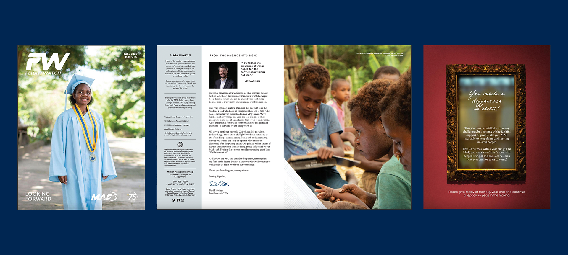
With my expertise in editorial design, I was approached by Mission Aviation Fellowship to revamp both their publication, FlightWatch, and its logo.
To align with MAF's brand identity, I utilized their current typeface, Museo Sans. In order to create more negative space for headlines and subtitles, I adjusted the logo to align flush left and abbreviated the name to simply FW. The new FW logo was stylishly bold and had an aerodynamic feel thanks to the curved top right of the "F" and the bottom right corner of the "W," matching MAF's current logo.
The publication's layout was also modernized to match the new logo design. The minimalist layout featured only two typefaces, Museo Sans and Gotham to create a refined branding aesthetic. The design was strategic in allowing more room for photography and ad space.
The publication and logo redesign were a resounding success and have been consistently used in all editions of FlightWatch.
Client: Mission Aviation Fellowship and FlightWatch
Role: Graphic Designer

Project Deliverables:
• Rebrand Publication & Logo
• Design & Layout

Back to Top